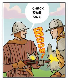
This article is part of a series:
Animated Gifs That'll Science You Fast
|
NEXT
7 of 12 |
We all know engineering is useful, functional, even ingenious. But the engineering photography competition we hold each year provides us a chance to wander outside its merely utilitarian aspects into dimensions such as beauty, humour and even humanity to find unexpected connections and poetic resonance.
As one of the judges, one quality I look for in the images is some added dimension, a richness, the capacity to trigger a cascade of unrelated ideas. Quite by accident this year a few of the photos shared an unplanned underwater theme.
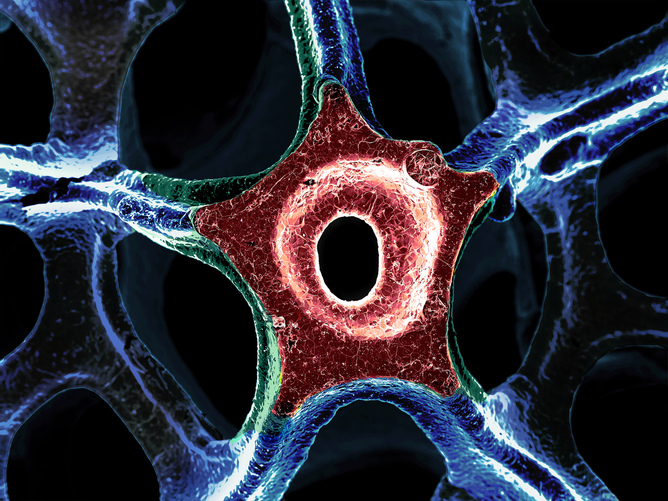
The winner (above) appeared to be a starfish. There was a column, perhaps from a pier, encrusted with coral and barnacles.

Cambridge University, CC BY-NC-SA
Then there was a strange ghost fish, the likes of which might range in Challenger Deep.

Cambridge University, CC BY
Of course they were none of these things: they were images of carbon nanotubes and graphene, but the forms that emerged at these micro- and nano-scales are familiar from elsewhere in nature.
The winning photo shows a fine pentagonal shape – I lecture on geometry and a question I ask the audience is: “When did you last see a pentagon?” They’re quite rare. They can be found in passionfruit flowers, or the shape of one of the most well-known buildings on the planet. But pentagons in the wild are something of a collector’s item – and this a fine example.

Cambridge University, CC BY
Second prize went to a re-imagining of a van Gogh painting, as the artist may have painted had he a larger canvas. Based on a playful use of mathematics, a computer algorithm analyses a pattern and style and extrapolates it to fill a larger area. It demonstrates the new science of machine learning that is now entering our lives, from junking spam emails to the product or content recommendations websites suggest.

Cambridge University, CC BY
Third prize went to Francis the Engineer, an image that represented the human dimension of engineering. The children’s smiles are fabulous, but emphasise not just happiness but relief at having their essential need for clean drinking water met. Engineering is not all about jet engines, smartphones and nanotubes.

Cambridge University, CC BY
The glass shear pattern is striking, like a flow of lava, or molten sugar, there are hints of rainbows among the sumptuous red – so many positive resonances from what is essentially a piece of broken glass.

Cambridge University, CC BY
The similar stretch and swirl image of fluid dynamics reminds me of the timeless pleasure of watching the flicker of bonfire flames, but freeze-framed so you can admire their inner structures: paisley patterns and curling vortices – all this found in what is essentially the inside of an engine chamber.

Cambridge University, CC BY
The two images of graphene revealed symmetrical patterns of clover and flowers. The four-leafed clover is a symbol of good fortune, and here there are fields of them, looking like a some architect’s plan of futuristic tower blocks.

Cambridge University, CC BY
The red flowers have six-fold symmetry, and although we rarely give prizes to images created on a computer (it is so much easier to make pretty virtual shapes than to actually build them at the nanoscale) this one pleased with its interconnecting shapes, representing the electrical flow across a graphene lattice.

Cambridge University, CC BY
An old bridge over the River Cam at the back of the engineering department in Cambridge, supported by two truss beams: the photo shows what is known as the “web” of the beam, the vertical face between handrail and deck. And within the web, the photo captures another: the spider’s web shares the same structural principles – the flow of tension within the silk matches that acting on the steel diagonals. I sometimes think that bio-mimetics is often accompanied by overblown rhetoric, but the unspoken simplicity here appealed to me.

Cambridge University, CC BY
This nano-scale image is decidedly other-worldly, unlike any landscape I ever saw despite its title. Perhaps it’s where they leave planets to dry before sending them out into the universe. I like how an image of something so small can so readily conjure the impression of something so vast. Perhaps we have the microscope the wrong way round.

Cambridge University, CC BY
The same applies to the magnetic field image: taking aside the extraordinary iridescent colours produced by birefringence (the property of refracting light in different ways), it is an image of something so small as to be almost invisible, yet we see only the Earth itself. I think William Blake said something about that once.
You can see the complete set of photos here.
![]()
Allan McRobie is Reader in Engineering at University of Cambridge.
This article was originally published on The Conversation.
Read the original article.

Mark Lorch, University of Hull
If you’ve ever sat opposite a doctor and wondered what she was scribbling on her notepad, the answer may soon not only be medical notes on your condition, but real-time chemical preparations for an instant diagnostic test.
Thanks to the work of a team of researchers from California Polytechnic State University, recently published in the journal Lab on a Chip, chemicals formed into pencils can be made to react with one another by simply drawing with them on paper. The team may have taken inspiration from colouring books for their take on a chemical toolkit, but their approach could make carrying out simple but common diagnostic tests based on chemical reactions – for example diabetes, HIV, or tests for environmental pollutants – much easier.
The project started with an established technique called paper-based microfluidics. This uses the capillary effect of paper to carefully mix together what are called reagents – those chemicals mixed to form a reaction, or to measure the presence or absence of a substance. The capillary effect in action is easily seen by dropping two inks of different colours onto a piece of tissue paper. As the liquid is absorbed by the paper the colour drops spread out until they merge with one another and form a colour blend. In the same way two or more reagents can be mixed with water on a strip of paper.

Lab on a Chip/RSC
In this case, the difference is that the reagents aren’t added to the paper via droplets. Instead they’re applied via pencils, meaning that without specialist equipment anyone can set about creating chemical reactions by simply using them on the paper.
The team made the reagent pencils by pulverising a mixture of graphite (just as you’d find in normal pencils), test reagents and polyethylene glycol, which helps to keep the reagent dispersed throughout the mixture, as is used for the same reason in toothpaste. They compressed the mixture into pellets and mounted them into mechanical pencil holders bought from the high street stores.
The reaction paper pad was created by using a waxy ink to print small connected enclosures onto filter paper. The reagent pencils could be used to colour in these areas within the enclosures – when water was added to the paper, the reagents dissolved and, confined by the waxy ink, were forced to diffuse towards one another and react.
The team demonstrated a potential use of the reagent pencil technique by using it in place of a common test used by diabetics to check their blood glucose levels, which involves reacting a pinprick blood sample with a chemical solution and examining the result.
One pencil was constructed with a mixture of enzymes, one called horseradish peroxidase (HRP) and the other glucose oxidase (GOx). A second pencil contained a reagent called ABTS. When combined in the presence of glucose these react together to give a blue-coloured product. Comparing the results from their pencils on the pad with the more traditional dropper method used by diabetics the team found the results were identical.

Lab on a Chip/RSC
The image shows, on the left, the reagents applied via droplets of solution. On the right, the reagent pencils were used. The top row shows the paper at the beginning of the test, the bottom row the result. Applied to the left enclosure, the sample solution carries the two reagents together which react. The coloured product produced is, as shown on the graph, identical between the two methods.
This is of course extremely easy to set up. Traditional diagnostic tests require training, while this pad and pencil system requires no more than skill than required to colour within the lines. The reagents are extremely stable once made into pencils – usually they would degrade in a matter of days as liquids, limiting how and where the tests can be made. However the reagent pencils showed no sign of degrading after two months.
So this pencil tool kit has obvious advantages: a kit of reagent pencils, much like a box of colouring pencils, is easily transported, without the chemicals degrading. Kits could be designed with particular tests in mind – and the reaction mix can be adjusted by applying more or less, without the need or equipment to make-up complex solutions. There’s scope to monitor environmental pollutants, carry out diagnostic tests in remote locations – not to mention teach chemistry in primary schools.
![]()
This article was originally published on The Conversation.
Read the original article.
It’s hard to imagine higher dimensions. Even one additional spatial dimension is hard to see with your inner mind’s eye. If you want to imagine six, seven or eight spacial dimensions it isn’t just hard – no one’s even truly conceptualized hyperspace. It’s what makes the subject compelling but also what makes it frustrating to talk about. The examples theorists are able to use to help people “visualize” what can’t be seen must work within human limitations, and are thus second and third dimensional examples of a higher dimensional concept or object.
“Wait a second,” some of you are wondering, “Isn’t TIME the fourth dimension?”
This article is about spacial dimensions only. Personally, I agree with Amrit Sorli and Davide Fiscaletti’s work which I feel adequately proves that time is NOT a spacial dimension. If you want to debate this issue further, you can read my reasoning in my follow up piece, Time: fourth dimension or nah?, also available on Cosmoso.net
One of the most basic exercises in multidimensional theory is to imagine moving in a fourth. The distance between you and everything around you stays the same but in some fourth dimension you are moving. Most people can’t truly do this imagination game because there in nothing in our three spacial dimensions to compare the experience to.
 Flatland
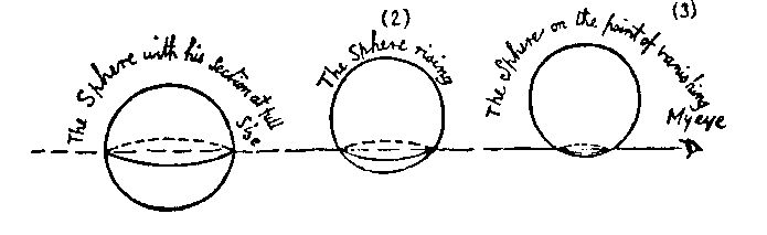
In the famous book about spacial dimensions, Flatland, living, two-dimensional beings existed in a universe that was merely two dimensions. A being with three dimensions, such as a sphere, would appear as a circle able to change circumference as it moved through a third dimension no one in flatland has ever conceptualized.
Humans evolved to notice changes in our three-dimensional environment, inheriting our ancestors ability to conceptualize space in three dimensions as a hardwired trait that actually stops us from conceptualizing other aspects of reality that might nonetheless exist. Other people see hyperspace as a theoretical construct of mathematics that doesn’t describe anything in reality, pointing to the lack of evidence of other dimensions.

A Tesseract. Many people in the advanced math classrooms of my generation of high school students struggled to wrap their heads around tesseracts without moving diagrams. If a picture is worth a thousand words are we talking animated gifs and words used to describe three dimensional space or should we make up a new saying?
We are able to conceptualize three dimensions in the abstract when we watch TV, look at a painting, or play a video-game. Anytime we look at a screen we watch a two dimensional image from a point outside that dimension. Having an outside point of view for a three dimensional space could give us a way to artificially understand a higher spatial dimension. Until that time comes, we are sort of stuck explaining fourth dimensions by demonstrating how it would look on a two dimensional screen which we view from a third dimensional viewpoint.
It’s kind of like imagining “one million”; you can prove it mathematically to yourself, you can count to it and you know how valuable it is but you can’t truly picture one million of anything. Trying to explain this conceptualization problem with words is pretty tough because your brain is not equipped to handle it. Humans try to wrap their minds around it and dream up ways to explain hyperspace to each other anyways.
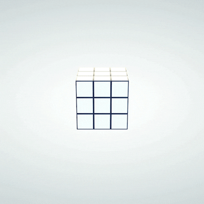 A rubix cube is particularly compelling as a multi-dimensional teaching tool, because it puts spacial dimensions in the abstract in the first place, and then gives the cube the ability to change the dimensional orientation of a third of it’s mass. It’s hard to wrap your head around a normal three dimensional rubix puzzle. By adding another dimension and using the same principle, one can ALMOST imagine that fourth spacial dimension. Most people can’t solve a three dimensional Rubix puzzle but if you think you are ready for the fourth dimension, you can download it and play it on your two dimensional screen, here: Magic Cube 4D
If you don’t think you’re ready to try and solve that puzzle but you want to know more you can watch this roughly 1/2 hour video about it:

While Miegakure is still under development, it’s set for release in 2015. Interactive games like this can spur collaborative thinking from a larger pool of collaborators – and make game developers tons of money.
If you want something a little less abstract than Rubix, check out this prototype for Miegakure, the surreal PlayStation 4 game that lets the user explore a four dimensionally capable world through three dimensional spaces that connect to each other through higher dimensions. It’s a great idea that makes everyone have the initial thought of wondering how the heck they coded it. Then the idea sinks in and you realize they wrote the code first and played with the visual manifestation as they went. It’s a great metaphor for the idea in the first place; begins as a concept rather than an observation. The essence of the argument against hyperspace actually existing is the lack of physical evidence. Unlike a ghost story or a spiritual, religious attempt to explain the supernatural, there is actually mathematical evidence that seems to make higher dimensions possible. It has logical evidence as opposed to empirical data. There are ways to observe without using human senses but it’s difficult to prove an observation of something the majority of humans have trouble even seeing with their mind’s eye, so to speak.
One day we might be able to use technology to increase our understanding of this abstract concept, and manipulate an entirely new kind of media. For now we are stuck with two and three dimensional visual aids and an mental block put in place by aeons of evolution.
|
Jonathan Howard
Jonathan is a freelance writer living in Brooklyn, NY |
Check out more of Hamlet’s Danish by Clay Yount at: http://clayyount.com/hamlets-danish/
Where do you live? Where are you from?
I’m a Virginian, born and raised. Born in Appalachia, and raised in a small town in Northern Virginia called Warrenton. I went to college at the University of Virginia, and I’m currently living in Fairfax County, Virginia.
What is your educational background?
My educational background is a hodgepodge of arts and sciences with a focus on languages. In high school I took lots of French and Latin, and in college, I took a bunch of Japanese language courses. Later I got into web development, which turned out to be a lot like learning a language, and made that my career.
Check out more of Hamlet’s Danish by Clay Yount at: http://clayyount.com/hamlets-danish/
When did Hamlet’s Danish start?
Hamlet’s Danish started in April of 2014.
Any other art or comics people can find from you online?
In college, I drew a couple strips for the school newspaper, and from 2004-2012 I did a comic called Rob and Elliot with my brother, Hampton Yount, as the writer. He’s a stand up comedian/writer and ridiculously funny. I have the archives for that comic up on my site.
Your characters make really appropriate facial expressions. How hard is that to do?
Well, it’s much easier now than when I started. I used to draw boring same-y faces a lot. I had a handful of expressions that I would overuse and it was something about my art that bugged me, so I made a conscious effort to practice it. I still have to check myself to make sure I’m not relying on repetitive easy expressions. Drawing a comic is kind of like planning and acting out a scene. I tend to make the face I’m drawing as I’m drawing it, which must look pretty ridiculous.
Check out more of Hamlet’s Danish by Clay Yount at: http://clayyount.com/hamlets-danish/
What inspires the way your characters look?
The characters change from week to week, so there’s not really a unifying look. I’ll also change up my style between cartoony and realistic based on the script, or just how I’m feeling that week. I’ll spend lots of time researching images for inspiration on posture or clothing, especially on the historical comics.
I also really like your dialogue and wide range of subjects that always have a nod to history, gaming and science.
You don’t seem to mind taking a shot at conventional wisdom. Do you have any political or social agenda behind the project?
My only agenda is to make the funniest comics I can. My views on science, culture, history, and politics will seep into that, for sure, but I’m not trying to use my comics as a platform for anything other than comedy. In general, I’m a big history buff and a huge fan of science, so those topics tend to crop up a lot. The only thing I try and stay away from is pop culture or meme jokes. They date quickly and I don’t make comics fast enough for it.
How long does it take you to get a one page comic like that done?

Check out more of Hamlet’s Danish by Clay Yount at: http://clayyount.com/hamlets-danish/
Anywhere from 6-10 hours. Sometimes more. It’s about 30% writing and lettering, 40% pencilling, 10% inking and 20% coloring.
What medium are you using? Is it all created digitally?
It’s all digital. I use Manga Studio 5 for the whole thing. I’m really into tech and made the switch to tablet drawing in 2002. I haven’t looked back since. I currently use a Cintiq, which is a great piece of hardware.
How much money does this project make you? Do you have a day job?
Check out more of Hamlet’s Danish by Clay Yount at: http://clayyount.com/hamlets-danish/
It doesn’t make a lot, but that’s on me. I have a great day job as a web designer/developer, so I haven’t really felt the need to work to monetize the comic. I don’t have a store because I dread order fulfillment, and I removed all ads from my site because they weren’t earning much, and I didn’t like how they looked. Monetizing is something I know I need to work on, but I’m making baby steps right now. I plan to have a store later this year, and I’m attending a few conventions where I’ll have books printed. Right now, my main focus is expanding my audience.
What has the response been like? How much feedback do you get and what’s it like?
My audience is still relatively small, so I only get a modest amount of feedback, but when I do, it’s been overwhelmingly positive. Every once in a while, I’ll make it to the front page of Reddit or Imgur or something and that definitely gives you a nice ego boost :).
Do you have any upcoming work?
Right now, I’m just plugging away at Hamlet’s Danish and trying to maintain a work/life balance with a new baby. Occasionally I’ll work on a side project, like a piece of art or a short story comic, and I’ll post it on my site’s blog. My most recent side project was making a free Squarespace template for webcomic artists. The only upcoming thing right now is getting ready for a convention and printing some books for it.
Check out more of Hamlet’s Danish by Clay Yount at: http://clayyount.com/hamlets-danish/
Check out more of Hamlet’s Danish by Clay Yount at: http://clayyount.com/hamlets-danish/
|
Jonathan Howard
Jonathan is a freelance writer living in Brooklyn, NY |
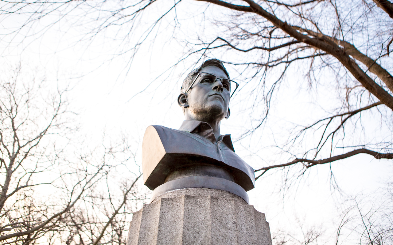
A lot of Cosmoso might have caught the John Oliver interview.
The interview is an instant classic and will be talked about for a long time but it was also genuinely funny, with some unexpected chemistry between Oliver and Snowden. It also featured probably the second best extended tech metaphor involving dicks.
That’s right. I said second best.
Other superficial highlights include John Oliver losing his mind during the half hour before Snowden showed up late, the alarming but totally unsurprising ignorance of Americans during the man-on-the-street interviews about privacy and a concise but fleeting description of Snowden’s Patriotism for the layman.
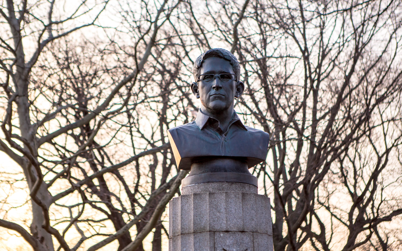
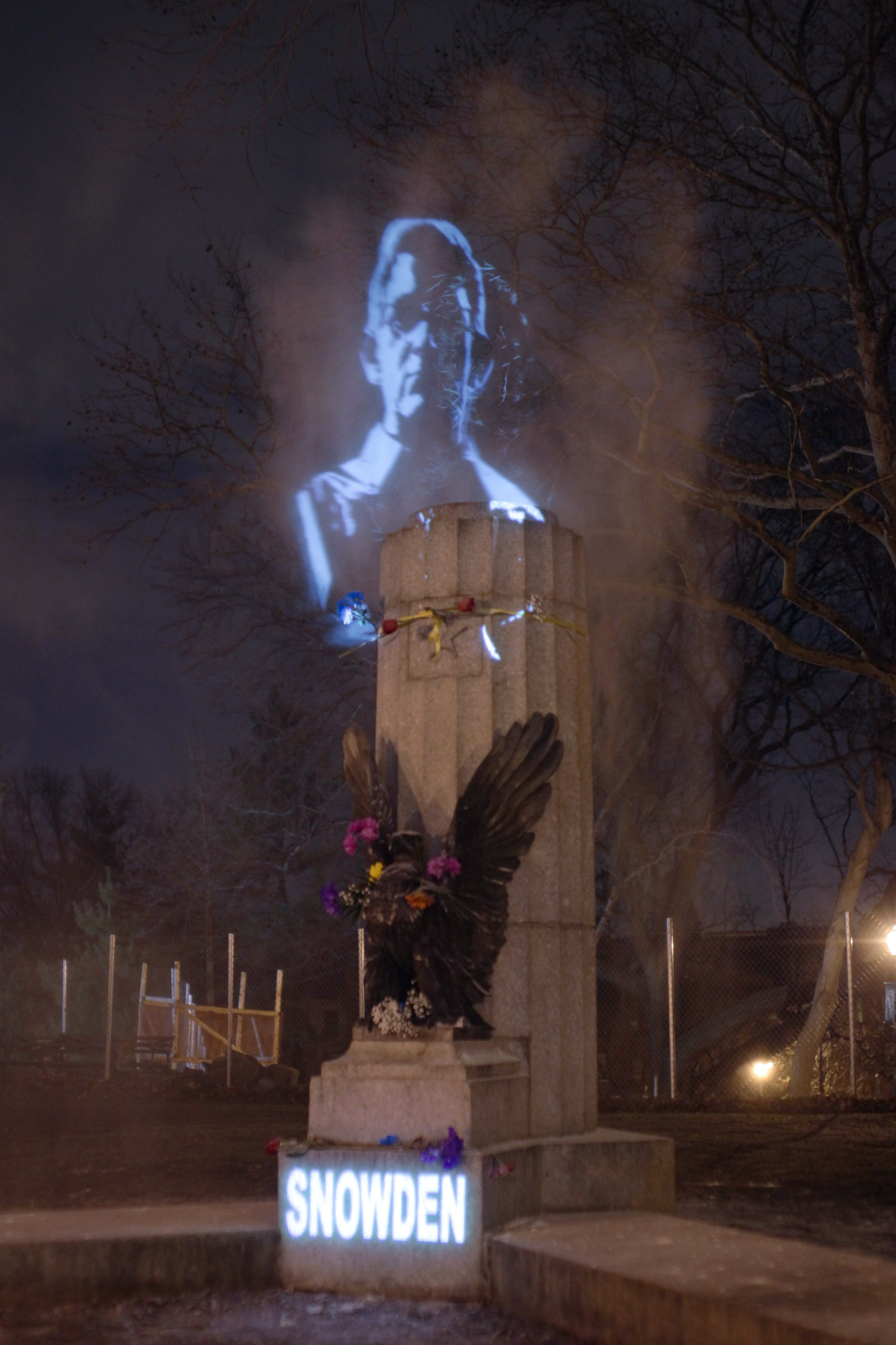
The morning after the interview aired, another iconic moment in revolutionary journalism happened. Three, anonymous street artists erected a bust of Edward Snowden in Brooklyn, video and still pics documented exclusively by AnimalNewYork. The work was covered with a tarp and removed within twelve hours because it was put atop an existing war monument, and done without permission.
Update:
A hologram of Snowden is currently being shown in the spot where the bust was removed, courtesy of The Illuminator Art Collective who used two projections and a cloud of smoke to show a likeness of Edward Snowden at the Revolutionary War memorial, releasing an accompanying statement:
“While the State may remove any material artifacts that speak in defiance against incumbent authoritarianism, the acts of resistance remain in the public consciousness, and it is in sharing that act of defiance that hope resides.”
|
Jonathan Howard
Jonathan is a freelance writer living in Brooklyn, NY |
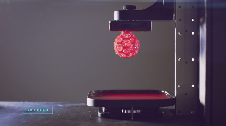
3D printing is one of the best up and coming tech fields to follow. CLIP 3D Printing is the fastest device to date. Designers and engineers are starting to rely on 3D printing to stay competitive but the process is far from streamlined. Companies like Carbon3D are ahead of the pack with the coolest looking printing process that just happens to also be faster than anyone else out there. By rethinking the way the resin is cured, Carbon3D got their newest printer to produce 25-100 times faster than any other resin printing techniques, as of early 2015. It’s like they just couldn’t decide between fast an beautiful.
Peep the video at the bottom of this article~!
3Dprint.com broke the story, announcing Carbon3D’s Continuous Liquid Interface Production technique. CLIP built off of the most innovative ideas that have already been done with 3D printing by utilizing photosensitive resin and an incredibly precise laser to cure the liquid into a solid from the bottom of a clear pan. Inspired by techniques which print and cure layer-by-layer, CLIP instead uses it’s laser to cure in conjunction with oxygen which inhibits the curing process allowing for variable ratios of viscosity. This allows the printer to print in 3 dimensions simultaneously.
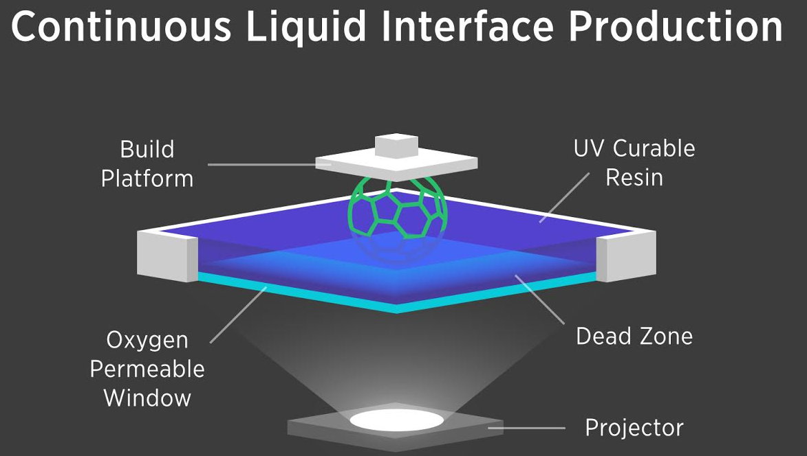
You can see the liquid from the top in the promotional media but the action happens underneath the pool. The transparent window that holds the pool of liquid “ink” is also oxygen-permeable. This allows controlled amounts of oxygen and laser light to hit the bottom of the liquid layer. Carbon3D explains the process can leave uncured spots on the bottom layer as little as a few dozen microns thick. As the oxygenated areas of the resin are decided, the laser cures the unoxygenated areas, leaving a layer of solid that is attached to the layer above. This amazing GIF speaks for itself. DAYUM:

Carbon 3D has managed to keep a proprietary amount of this technique secret while still nailing down $41 million in funding from venture capital firms. It’s almost like they 3D printed themselves from liquid into the solid competitive start-up they are today.
As the fastest guys on the scene Carbon3D are the hottest new guys. The slow production speed is one of the biggest reasons 3D printing hasn’t become the manufacturing norm and CLIP printing is expected to change that moving forward from early 2015. Cosmoso.net is watching this fascinating development on the edge of our 3D printed seats.
|
Jonathan Howard
Jonathan is a freelance writer living in Brooklyn, NY |
Much like a painting, a photograph has the ability to move, engage and inspire viewers. It could be a black-and-white Ansel Adams landscape of a snow-capped mountain reflected in a lake, with a sharpness and tonal range that bring out the natural beauty of its subject. Or it could Edward Weston’s close-up photograph of a bell pepper, an image possessing a sensuous abstraction that both surprises and intrigues. Or a Robert Doisneau photograph of a man and woman kissing near the Paris city hall in 1950, a picture has come to symbolize romance, postwar Paris and spontaneous displays of affection.

Wikimedia Commons
No one would question that photographs such as these are works of art. Art historians can explain the technical and artistic decisions that elevate photographs by the masters, whether it’s Weston’s use of a tiny aperture, Adams’ printing techniques or Doisneau’s distinctive aesthetic. It’s clear that Pepper No. 30 belongs in a museum, even if a selfie posted on Facebook doesn’t.
Oddly enough, it was not always this way. Photography has not yet celebrated its 200th birthday, yet in the medium’s first century of existence, there was a great deal of debate over its artistic merit. For decades, even those who appreciated the qualities of a photograph were not entirely sure whether photography was – or could be – an art.
In its first incarnation, photography seemed to be more of a scientific tool than a form of artistic expression. Many of the earliest photographers didn’t even call themselves artists: they were scientists and engineers – chemists, astronomers, botanists and inventors. While the new form attracted individuals with a background in painting or drawing, even early practitioners like Louis Daguerre or Nadar could be seen more as entrepreneurial inventors than as traditional artists.
Before Daguerre invented the daguerreotype (an early form of photography on a silver-coated plate), he had invented the diorama, a form of entertainment that used scene painting and lighting to create moving theatrical illusions of monuments and landscapes. Before Nadar began to create photographic portraits of Parisian celebrities like Sarah Bernhardt, he’d worked as a caricaturist. (An aeronaut, he also built the largest gas balloon ever created, dubbed The Giant.)
One reason early photographs were not considered works of art because, quite simply, they didn’t look like art: no other form possessed the level of detail that they rendered. When the American inventor Samuel F B Morse saw the daguerreotype shortly after its first public demonstration in Paris in 1839, he wrote, “The exquisite minuteness of the delineation cannot be conceived. No painting or engraving ever approached it.”

Wikimedia Commons
A photograph of a haystack, with its thousands of stalks, looked visually staggering to a painter who contemplated drawing each one so precisely. The textures of shells and the roughness of a wall of brick or stone suddenly appeared vividly in photographs of the 1840s and 1850s.
For this reason, it’s no surprise that some of the earliest applications of photography came in archaeology and botany. The medium seemed well suited to document specimens that were complex and minutely detailed, like plants, or archaeological finds that needed to be studied by faraway specialists, such as a tablet of hieroglyphics. In 1843, Anna Atkins produced Photographs of British Algae: Cyanotype Impressions – considered the first book illustrated with photographs.
Finally, the genesis of a painting, drawing or sculpture was a human hand, guided by a human eye and mind. Photographers, by contrast, had managed to fix an image on a metal, paper, or glass support, but the image itself was formed by light, and because it seemed to come from a machine – not from a human hand – viewers doubted its artistic merit. Even the word “photograph” means “light writing.”
Before the photograph, painted portraits had almost always flattered the client and conformed to the fashions of the day; meanwhile, the earliest photographic portraits didn’t.
Elizabeth (Lady) Eastlake, one of the foremost 19th century writers on photography, listed many of the photograph’s shortcomings when it came to rendering the female face. In a black and white photograph, blue eyes looked “as colourless as water,” she wrote, blonde and red hair seemed “as if it had been dyed,” and very shiny hair turned into “lines of light as big as ropes.” Meanwhile, she noted that the male head, with its rougher skin and beard or moustache, might have less to fear, but still suffered a distinct loss of beauty in the photographic portrait. To Lady Eastlake, the photograph, “however valuable to relative or friend, has ceased to remind us of a work of art at all.”

Wikimedia Commons
Debate over photography’s status as art reached its apogee with the Pictorialist movement at the end of the 19th century. Pictorialist photographers manipulated the negative by hand; they used multiple negatives and masking to create a single print (much like compositing in Photoshop today); they applied soft focus and new forms of toning to create blurry and painterly effects; and they rejected the mechanical look of the standard photograph. Essentially, they sought to push the boundaries of the form to make photographs appear as “painting-like” as possible – perhaps as a way to have them taken seriously as art.
Pictorialist photographers found success in gallery exhibitions and high-end publications. By the early 20th century, however, a photographer like Alfred Stieglitz, who had started out as a Pictorialist, was pioneering the “straight” photograph: the printing of a negative from edge to edge with no cropping or manipulation. Stieglitz also experimented with purely abstract photographs of clouds. Modernist and documentary photographers began to accept the medium’s inherent precision instead of trying to make images that looked like paintings.
“Photography is the most transparent of the art mediums devised or discovered by man,” wrote critic Clement Greenberg in 1946. “It is probably for this reason that it proves so difficult to make the photograph transcend its almost inevitable function as document and act as work of art as well.”
Still, well into the 20th century, many critics and artists continued to view photography as operating in a realm that was not quite fine art – a debate that even continues today. But a look back to the 19th century reminds us of the medium’s initial shocking – and confounding – realism, even as photo portraits printed on calling cards (“carte de visites”) were becoming as fashionable and ubiquitous as Facebook and Instagram today.

![]()
This article was originally published on The Conversation.
Read the original article.
Since they were pioneered by Robert Hooke 350 years ago, microscopes have been extending our vision. In the 21st century, scanning electron microscopy (SEM) and confocal microscopy, which uses a pinhole to remove out-of-focus light and allows 3D structures to be built from multiple images, have pushed the boundaries of resolution. Further still, nanoscopes that use fluorescence to circumvent limitations in SEM are already winning Nobel prizes.
The Wellcome Images Awards 2015 are a showcase of the best in science imaging techniques, and this year’s crop of winners gives a rich glimpse into a world normally unseen by the human eye. And as we learn more about the intricacies of our bodies and the world around us, the images transform abstract ideas and the constantly moving machine of our bodies into works of art and visual drama. Four nominees for this year’s prize tell us how they got their image.
Robert Marc, Calvin and JeNeal Hatch Presidential Endowed Chair, University of Utah

Jefferson Brown, Robert Marc, Bryan Jones, Glen Prusky, Nazia Alam
We have been perfecting a technology for imaging the metabolism of cells. The core principle is microscopically visualising arrays of up to a dozen different small molecules and computationally fusing these into readable colour images. The molecules are detected by immune probes developed in my laboratory and each mixture of molecules forms a cellular “signature” colour.
The molecules in this image are mapped into image colour channels: aspartic acid as red, glutathione as green and glutamine as blue. Aspartic acid links amino acid and energy metabolism. Glutathione is our primary defence against oxidative damage. Glutamine is a molecular “battery” that stores and distributes amino groups to other molecules.
The image is a thin slice through the various kinds of filtering cells of the mouse kidney. Surprisingly, the images reveal that all tissues, not just kidney, are rainbows of different cell types, each with a unique metabolism. This contradicts our expectation that metabolism is roughly the same in all cells and opens the door for a new generation of molecular tests of cell state in health and disease. Though the kidney yields a spectacular and fiery display, we have yet to craft a theory that explains it.
Gregory Szeto, Koch Institute, MIT

Gregory Szeto, Adelaide Tovar, Jeffrey Wyckoff, MIT
This image is one in a series we captured to examine the distribution of engineered, micrometer-sized drug particles (red) targeted to mouse lungs (blue, green). Scale in science and engineering is fascinating, and as technology has advanced, we’ve increased our ability to take both smaller and larger images with detail and range. Using fluorescent imaging and a confocal laser microscope, we imaged whole lungs at different times to determine where drug particles go.
Information at the organ scale is important when designing particles to obtain even, specific and prolonged delivery of drugs throughout the organ. We can now use whole organs (as opposed to traditional thin slices of tissue on glass slides) to image distribution at this level while also acquiring information about smaller details. This same set of images (more than 1,000 total condensed into a single 2D image) can be made into an interactive 3D model where we can zoom in and out of the organ to find out where our particles are aggregating and distributing, potentially down to single cells.
Speaking as both a scientist and an artist (avid photographer and writer), there is a great deal of overlap between the two areas. Science, technology, engineering, and math (STEM) are often set apart from other fields, particularly arts and humanities. In reality, there is so much art in STEM: the visual beauty of an experiment image is not unlike a moving painting or photo; the elegance of manuscript text can rival that of the best prose. Ultimately, innovative scientific research is driven partially by the same intuition that often drives and inspires great art. Striking visuals are just one way for us to stir curiosity in everyone about the work that we love.
Michael Hausser, Professor of Neuroscience, University College London

Michael Hausser/Sarah Rieubland/Arnd Roth/UCL
This is an image of a single Purkinje cell in the cerebellum captured using a focused ion beam scanning electron microscope. This kind of electron microscope is relatively new to biology, and uses two beams to image neurons within a block of brain tissue: the first beam etches away the top few nanometers of tissue, and the second beam then captures the image. In this way, neurons and circuits can be imaged at extremely high (nanometer) resolution, while keeping the block of tissue intact (without the loss of resolution and distortions resulting from conventional knife-based sectioning of tissues for electron microscopy).
I find this image endlessly fascinating: not only does it reveal the incredible richness and complexity of the dendritic tree of an important cell type (the processing carried out by Purkinje cells is crucial for precisely timed learned movements); but it also exhibits a beauty that is both ethereal yet precise, like a Japanese woodcut.
Khuloud Al-Jamal, Senior Lecturer in Nanomedicine, King’s College London

Khuloud T. al-Jamal, Serene Tay, Michael Cicirko
The blood-brain barrier is a protective layer of cells that regulates entry of molecules to the brain. Despite acting as a protective mechanism, it also acts as a barrier to delivering drug therapies to the brain. Astrocytes, specialised star-shaped glial cells (non-neuronal cells that support and protect), outnumber neurons over fivefold. These cells contiguously tile the entire central nervous system (CNS) and exert many essential complex functions.
Astrocytic tumours are the commonest type of cancer of the brain. Over the past 40 years systems to deliver drugs to treat these cancers have emerged. Carriers that have been investigated have ranged in size from 10 to 1,000 nanometres. One example of such carriers is a carbon nanotube, a hollow cylinder made from a continuous unbroken hexagonal mesh of carbon molecules, first explored by electron microscopist Sumio Iijima in 1991.
Our image is a scanning electron micrograph of an astrocyte cell (coloured in brown), with a diameter of about 20 micrometers, and captured in the process of taking up carbon nanotubes (green colour). New approaches to brain drug delivery will be the key to unlocking the brain and tackling neurological disorders that would otherwise remain incurable.
Albert Cordona, Janelia Group Leader, Howard Hughes Medical Institute

Albert Cordona/HHMI
Mark Bartley, Cambridge University Hospitals NHS Trust

Mark Bartley
Cutting-edge imaging techniques may delve into the smallest worlds but photographs still powerfully capture our dramatic outer shell as this clinical photograph of an elderly woman’s curved spine shows.
Michael Frank, Photographer, Royal Veterinary College

Michael Frank
If you’ve never eaten tripe but have wondered what a stomach looks like, here’s an image of one taken from a goat.
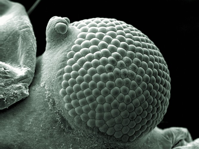
Kevin Mackenzie, Microscopy Manager, Institute of Medical Sciences, University of Aberdeen

Kevin Mackenzie
A scanning electron micrograph of a greenfly’s eye.
Nele Dieckermann and Nicola Lawrence, University of Cambridge

Dieckermann and Lawrence, Cambridge University
Natural killer (NK) cells in our immune system are at the frontline of our immune response and are rapidly deployed by the body to fight infections or growing tumours.
Luis de la Torre-Ubieta, Postdoctoral Fellow, Geschwind Lab, UCLA

Luis de la Torre-Ubieta
To see startling Wellcome Images 2014 showing strange and beautiful science up close, click here.
![]()
This article was originally published on The Conversation.
Read the original article.